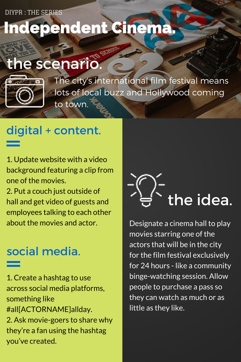
Binge watching. To me, nothing sounds better than a whole day in front of Netflix, with all the seasons of Bob’s Burgers queued to play one after the other. But binge watching can get lonely. So here’s an idea to get everyone doing it together!
I thought a great opportunity for community-binge-watching would be a local film festival, like TIFF. An independent theatre could play movies featuring an actor, director or genre for 24 hours and offer $15 tickets for the day, allowing people to come and go as they please.
A great opportunity to get some content would be to put a couch outside of the theatre room and invite moviegoers to share their thoughts before or after each showing.
Plan for an Independent Cinema / Theatre: Click to View + Download
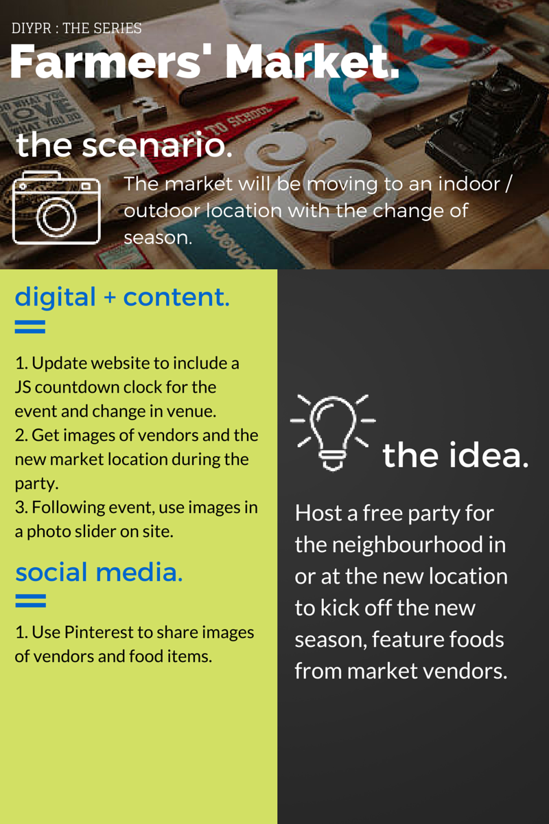
The farmers market by my old apartment happens outside during the warm months, and then goes inside a small house at Sorauren Park when it gets cold outside.
Farmers markets have nearly perfect opportunities to host parties whenever they want: People have to go outside anyway, there’s no issue of finding a venue and the food and drink is pretty much always taken care of.
So with that, here’s a plan that can help get people together outside the regular hours and build community engagement. If you’re part of a farmers’ market that moves indoors or outdoors depending on the season, this could be a great way to let people know where to go when the weather changes.
Plan for a Farmers’ Market: Click to View / Download
A couple months ago, when I was getting ready to write the first version of this post, I had an email-conversation with Frank Maidens from Studio Function. I was asking him about the topic of the post, and he mentioned something that I thought put the idea in clear terms:
“the need to anticipate the requirements/goals of users who are viewing site content from various devices.”
Well said, I think.
Here are five examples of how this is done, and way below ten tips for using this on your own site.
Five examples:
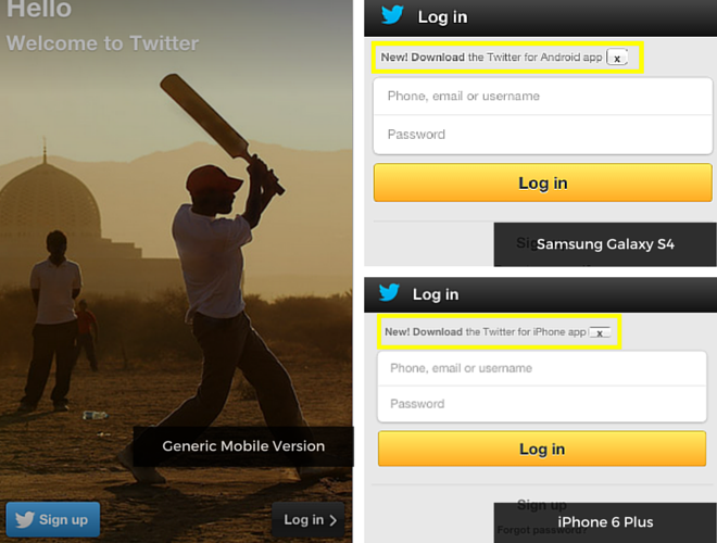
1. Twitter
Twitter removes a lot of the homepage copy if you’re visiting the site from a mobile device. And that makes sense… if you’re visiting twitter.com from a mobile device, you probably already know what’s up.
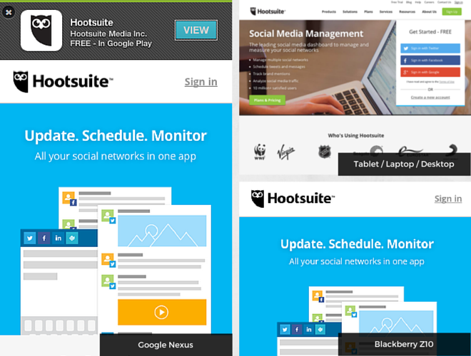
2. Hootsuite
Like the Twitter example, Hootsuite also removes a lot of copy and includes a link to download the app if you’re on an Android device. If there’s no app for your device there’s no link.
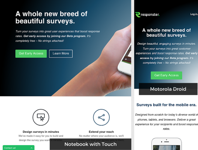
3. Responster
A simple example from a new start-up, Responster. The second section of the site changes on smaller viewports.
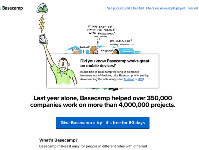
4. Basecamp
Surprise! This pop-up shows if you resize the browser window on Basecamp.com and disappears after a few seconds. A smart way to target developers who love playing around with the corners of their browser window.
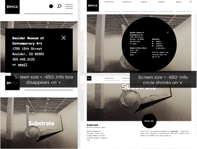
5. Boulder Museum of Contemporary Art
BMOCA puts the important information front and centre. Literally. A pop-up circle that literally stays on the screen as you browse the home page from a desktop or laptop. But on screens smaller than around 650px, this info disappears when closed.
Ten Tips:
1. Put hours and location information front-and-centre.
Ideal for: retailers with brick + mortar locations.
Another great way to improve user experience would be to include a list that live updates with open locations, or tell mobile visitors which stores are open / closed depending on the time. A perfect use-case for this would be if you’re having an event, like the wedding site for Frank + Vivian from Studio Function. If someone’s visiting your website from a mobile device and you have a big event coming up, chances are they’re looking for related information.
2. Show off what you’ve got / can offer a specific market.
Basecamp does a great job of this on browser resize. If you have a business that targets other devs (ie. people who will also be resizing their browser to see if your site is responsive), why not include something that sends them a message. Or if your business specializes in app development, mobile strategy, etc., make this information easy to see.
3. Point visitors to where they can download an app for their device.
Ideal for: If you have an app.
If you don’t, give users an option to sign up for updates. If your team hasn’t developed an app for a popular platform or device it might be a good idea to explain that decision in a blog post or FAQ, like this.
4. Put search bar up-front + popular stories of the day.
Ideal for: news / magazines, story sites.
Someone visiting a site that’s about news or stories is probably looking for a specific post or article. Make it easy for them to find this information quickly.
5. Talk about who you are and what you do right away.
Ideal for: people building their rep, start-ups
Kind of like the Responster idea above, move information about who you are to the top so site visitors quickly get to what’s important. If most people visiting your site will be first-time visitors, you’ll want them to know what you’re about right away.
6. Make finding the calendar and scheduling an appointment really easy.
Ideal for: real estate agents, personal trainers, life coaches, therapists, etc.
If your business relies heavily on setting appointments and your availability.
Ideal for: real estate agents, personal trainers, life coaches, therapists, etc.
This also works if you’re business relies heavily on setting appointments or your calendar. Say, for example, you’re a real estate agent. If someone is visiting your site from a mobile device they probably want to know where you are or need to get in touch with you quickly.
If you’re a small or specialty retailer, or an author, you have an opportunity with RWD to promote any new products or books. Again, visitors from a mobile site are probably not going to spend a lot of time on your page, so just including a pop-up with any news or updates can help them navigate.
9. Another app idea: show mobile users what your app looks like on their device.
Ideal for: if you have a new, yet-to-be-released app.
I haven’t found any examples of how this could be used, but if you have an app that won’t be released yet you could show users on mobile devices what your app will look like on their specific device (instead of including a link to download the app for their device). Like a “sneak-peek”.
10. If possible, simplify the sign-in.
Ideal for: sites with communities, accounts, anything that requires users to log in.
Pulley was praised in this article for their super-simple sign-in process. The e-commerce app uses account urls, where the user types in a password to access their account.
So, what is it that you actually, like, do? – The Question
I’ve been playing around with a few different ways to describe what it is that I actually do. I’ve called myself a “digital marketer”, a “content developer”, “content marketer”, “digital content marketer”.
I try not to take this naming stuff too seriously and just focus on the work. But it’s become a bit of a game – a challenge I’ve accepted to try and find the perfect way to describe what it is that I do.
Then one day I got an idea. It started in my brain like: “Wouldn’t it be great if I could create something that could perfectly describe what I’m trying to get at? Maybe instead of trying to come up with the perfect phrase, I could just draw a picture.”
So I came up with something…
The idea behind it is that this “stuff” — public relations, creating content, social media, marketing — can be easy. Especially for entrepreneurs, business owners, freelance consultants, independent-types who pretty much do everything (if not almost everything) on their own.
The key takeaway in this series of posts is:
PR opportunities are everywhere. Use those opportunities to build your social media profile and develop content that you can use and reuse.
If you’ve got a small business or you’re an independent consultant, and you’re going to host an event, do a talk or some other thing where you’re the centre of attention, make it a habit to get and track content from that event.
Keep in mind when creating content that the best stuff is content you can repurpose. If you create a blog post, presentation or video, create another piece for repurposing that you’ll keep. This way you can share something immediately and you also have something you can use in the future. Maybe use a calendar to pick a date for repurposed content, so that you don’t post something when it’s past the “expiration date”.
The big content guys do stuff like this all the time. They’ll have a webinar (the PR part), live tweet during the webinar (social media) and then have some type of content on their sites to connect with the webinar, such as a blog, or they’ll just post the webinar itself on YouTube or their website. Then sometimes that content will be reused in some way, maybe via a presentation or short infographic.
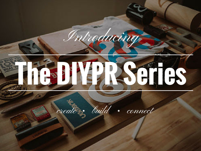
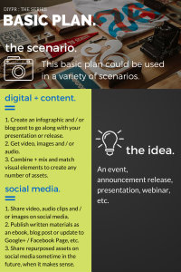
The “Basic” DIYPR.
What to expect.
So over the next year, I plan to publish one or two DIYPR Series posts a month. I picked twenty business or organization types and described a PR tactic that could be used for that business in a particular scenario. Then I made up some ideas to show how each initiative could translate to social media and creating content.
Here’s what each post will look like:
business / organization type (ie. bakery, farmers’ market, etc.)
scenario: not applicable in most but I tried to include common scenarios, like a film festival or book release
the idea: could be considered “traditional PR” (ie. an event or campaign)
digital + content: ideas on creating content out of the idea, stuff that can be used for your website and would be easy to share on…
social media: I tried to go beyond “share photos on Twitter” for this section
What’s the catch?
There is none. The graphics, ideas and everything else associated are under a strict Do-Whatever-The-Hell-You-Want [Forever] License. Feel free to take and tweak as much as you like.
Just like with anything else though, the ideas shouldn’t be used in isolation. Feel free to use them as part of a plan you have already, or as a way to kick/jump-start your own efforts.
So with that out of the way, next week in the DIYPR Series: The Basics.
A couple weeks ago, I attended a webinar for the Content Management Institute on website rebranding and redesign. It was an apt topic for me because I spent pretty much the whole Christmas break this past year on rebranding and redesigning my own site.
It’s strategy that wins wars… You have to have your website strategy clearly in mind before kicking off any redesign or rebrand project. Know what you want your new website to do. – Lou Jordano (CMO, Ektron)
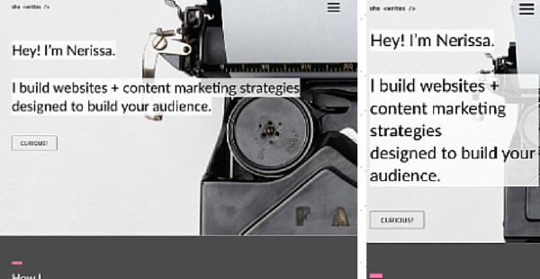
Before: nerissamartin.com
Here’s some points on how I knew it my site needed to be redone. Hopefully something here can help you decide if you need to overhaul your own website, but if not, you’ll find four more reasons to rebrand your site below.
1. I knew I would still have to explain ‘what I do’ to anyone who visited.
While I was building the site, a part of me was getting mentally prepared to explain to people what I did. I knew that visiting the site wouldn’t explain everything right off the bat (hence the site I have now :)). I wanted my site to be all about my blog, so having it front and centre seemed to make sense. But my site wasn’t built to just be a blog, it’s basically the centre of everything I do, so it needed to be more than just a place I could list posts.
Being the core of my business, you would think the ‘About’ section (or information) would be essential. But on my old site it was literally a bunch of images that didn’t really say anything. Talk about a missed opportunity.
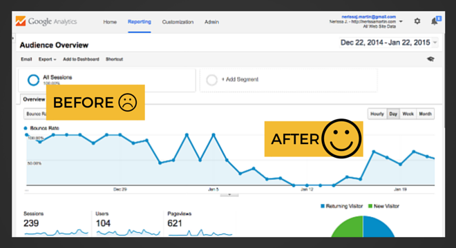
2. The bounce rate was ridiculously high, like 99.999%.
This is perhaps the biggest reason I know the redesign worked. After redo, the bounce rate dropped significantly. Granted, my site is more or less one page, but compared to other similar sites, the bounce rate is right where it should be.
3. The site was inconsistent with who I was / what I did.
I wanted to include everything on the site – I’d gone to school a bunch of times, wrote a book and sang on the side. I wanted the site to have all that stuff in it but after a meeting with Heather, CEO @ HackerYou, I realized that in throwing everything on my site I had made a messaging-mess.
Rebranding gave me the opportunity to think of more creative ways to say what I wanted to. For example, using the typewriter image as the background for the first section. I also thought of blog post ideas and other ways I could use content to talk about music and writing.
4. I knew I would have to rebrand / redesign the site halfway through completing it.
This point speaks more to paying attention to your intuition. While I was building the site, I knew I would have to redo it. By the time this dawned on me I was halfway through, so throwing everything away didn’t even cross my mind.
I figured I would stay on track and that the finished product would be a kind of ‘holding page’ to just have ‘something up there’ until I got a real site. Except it wasn’t. I was spending hours on it, much more time than should have been if its purpose was really only temporary.
Sure I learned some new things and put my fresh HackerYou skills to use, but I was too far deep in building the site to get any perspective. This is where I learned the lesson of having a vision for your site.
After: nerissamartin.com
Do You Need To Rebrand / Redesign Your Website?
I’m going to resist the urge to find every outdated / ugly site online and just post links with a full description of what they’re doing wrong. We’ve all seen a site that could use a refresh; doing that would be what the kids call “a read”. So here are four more reasons you may need to rebrand or redesign your site:
1. Your site was built more than three years ago and hasn’t been touched ever since.
2. Your business has gone through some major changes.
Is there stuff on your site that is no longer relevant to you or your business? Do customers continually ask you for products or expect certain things because they ‘saw it online’? The solution is simple: update your site!
Use the opportunity to educate your current / potential customers and clients about your business. You’ll spend less time answering questions and more time making money.
3. You’re getting not-so-great feedback about the site, its features and / or functions.
If you’re getting unsolicited feedback on your site, consider it a gift. Most of the time visitors to your site will keep their [sometimes very valuable] opinions to themselves. But they’ve got insights, those silent witnesses. They have reactions to the way your site looks and how it works, and this information is probably exactly what you need to improve UI / UX.
Why not ask someone their opinion of your site, or send out a survey to a select group of customers / clients? Think of it as an opportunity to build a relationship and be prepared to offer them something in return.
Still got that lorem ipsum text and stock images up on your site? Then it might be time to redesign.
4. You want to, or are getting ready to, rebrand your business.
You’re lucky if you’re getting ready to make some changes to your business. Your website hasn’t been re-touched yet so in some ways you and your business are “starting fresh”.
While you’re considering rebranding your business, think about ways you could potentially update your website. You might want to reach out to a content marketing or development expert to ask about potential opportunities to update your site in a way that will be consistent with your new brand.
Having some guidelines can help you and your team decide how updates should be made, if they should be made. On a basic level, the changes to your site should follow the flow of your business. Rebrand your site if and when your business changes or people important to your business are telling you a redo is needed.
![DIYPR: Independent Cinema / Theatre [Free Download]](https://nerissamartin.com/wp-content/uploads/2015/01/DIYPR_Intro-1024x768.jpeg)