Nerissa — she's an author.

CategoryWeb Dev

Using the Caret Symbol Selector in jQuery to make CPT-Gold.

One of the things that was on my wish list as a consultant was a way to show potential clients a clean, easy-to-read proposal. Something that was consistent with my brand, could be created and shared easily, and that I could update or customize as much as I wanted to.

CARET_final

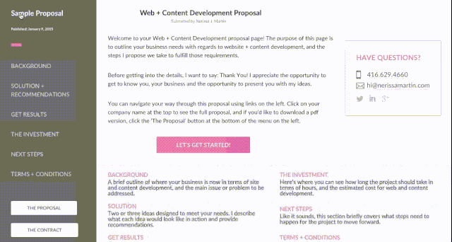
The most important thing for me was having all the information for each proposal in one post, but I wanted to break it up into sections that could be navigated through like a typical website.

Each menu item in the navigation bar would link to a section of the proposal, but I didn’t want the webpage to reload on every click.

Enter the ^ selector and jQuery. [Thanks to slipsum for some ipsum, and some swears.]

sow_preview2

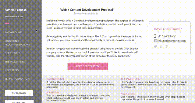
After planning out each section, the headings I needed, subsections and the overall flow I was able to create the custom post type. Then in the proposal template file, I pulled in each section under a specific ID, using “div_” at the beginning of each ID name.

The caret (^) selector in jQuery allowed me to select all divs with an id that started with “div_”. See here for more info.

To create the behaviour I wanted, I used .hide() on all the divs I didn’t want to show, while making sure to single out the section(s) I did want displayed with .show().

To start with, I created an intro ‘page’ that would be attached to each proposal. This would be the first thing users see when they land on the page, so all of the proposal sections needed to be under .hide() when the page loads.

Then once the user clicks on a menu item, all the “div_” sections are hidden, except for the one corresponding to whichever item was selected [I used .attr() to remove menu item links].

The title of each post would be the client’s name, so I used a .click() method on that to .show() all the sections (except for the intro) so the proposal could be viewed in full.

cmplt_sow_FINAL

Is your site getting the right traffic? Six steps to “yes”.

Last week I published a post on creating a vision for your website. This can help you decide the best direction to go in before development, and (spoiler alert!) can help you figure out what kinds of content you want to develop. After launch it can be tempting to just leave your site and hope for visits.

But we know better.

deploy3

Getting traffic isn’t just about getting traffic. Ideally you want to share useful content that’s targeted for your audience. If you’re doing that, the traffic you get will be people who are interested in what you have to offer.

So with that, here are six things you can do to make sure your audience finds your site.

1. Register your site with major search engines.

It takes five minutes.

2. Take care of your visitors.

Ideally you want visitors to go from being strangers to clients. Do you have content that helps them through this process? Stuff that requires them to stay a while? Here are some ideas on content you can develop that will help your visitors:

  • FAQs. Use any questions you get (or imagine you would get) on a regular basis. Think of this as content developed from your community, or as Copyblogger calls it ‘community data’.
  • Expose yourself. The ‘About’ page is part of what makes up any website. Think about expanding this to include anything anyone could ever want to know about your industry and business. This content could take any form that makes sense for you: blog posts, videos, etc.
  • The “Order” page. It’s great when someone is ready to buy. It’s also a great opportunity. If a site visitor is interested in buying your services or products, maybe they also want to subscribe to a mailing list or follow you on social media? Use your ‘Place an Order’ page to do get a sale and then build a connection.

3. Make an editorial calendar.

Following point #2, once you’ve created a vision for your site, you should have some idea of the types of content you’ll be publishing (ie. videos, blog posts, images, ebooks, news releases, etc.). You don’t even have to make a whole editorial calendar, just schedule posts and updates into the calendar you already use.

Here's a look at my editorial calendar. A constant work in progress.
Here’s a look at my editorial calendar. A constant work in progress.

4. Tell everyone you know, and everyone you don’t know.

  • Share on your social media profiles, send an email out to any subscribers or VIPs.
  • Update your business cards, flyers, t-shirts, boxes; anything you have with your business name on it is fair game.
  • Same goes for any content published to your site. Tell everyone when you publish anything new.

5. Learn more about web development.

  • You might be like,”but, why?” and “what does this have to do with content?” But don’t forget about your vision. Learn about the stuff you think you’ll eventually need so that when it comes time for you to build onto the site you have you’ll know what’s involved.
  • The second reason I recommend this is so you know how to update your site when you have new content. Nothing beats D’ingIY!

6. Check the map.

  • Keep your vision in mind and as business grows, check back in with the website to check that it’s consistent and represents your business accurately.
  • You should also make sure to have analytics set up on your site. I won’t go into too much detail (because), but in a nutshell as the owner of the vision you want to make sure you know how your site is performing against your goals.
  • In addition to tracking the traffic to your site, track traffic to the content you publish.
Conclusion

Get the right traffic to your site by registering on major search engines, create content that helps your potential clients and customers get acquainted with you and what you’re selling, and telling everyone you know. Keep your site consistent with your vision by checking analytics.

Five Steps to Building a Vision for your Website.

A recent conversation I had with a client about their website really sums up this post nicely.

They said: “I’d like something simple, just a page with my name and contact information.”

I nodded. More information almost always follows that sentence, so I waited for it.

“Then I want to be able to take orders online, maybe in the next six months or so.”

How will your website grow with your business?

Having a website is kind of like building a house. Maybe at first you just need the basics: a bedroom, kitchen and bathroom. But what do you do if you decide to have a family? And how will that house change as your family grows?

Most people would just buy a new house, which is where this analogy kind of fails, but your website should grow with your business. Just like you could build additions and new features on to your house, you could add pages, features and functions to your website.

Before you hire a developer or buy a template to fill in keep in mind what you want for your business, your website and how you’re going to talk to customers and clients online.

Maybe eventually you’ll want to take orders online like my client. Or maybe you want to build a community or sub-community within your industry, or have a huge list of subscribers.

If you’ve got big dreams for your business, that “basic” page might not cut it in a year or two.

The point is this: Have a vision for your website, one that matches the vision you have for your business.

Even if you already have a site, there’s no harm in reviewing it against your vision for your business.

Once you have that vision, you or your developer can start to plan the actual site (or the changes). Your vision will impact everything that goes into development.

As promised, here are the five steps:

1. Think about yourself + your business. First.

  • Where do you see your business in five / 10 / 15 years?
  • Will the website need to “do” anything to support your business vision? Like take orders, track return visitors or take subscriber information?
  • How much time do you have to devote to a website? Will you make all updates or will you need some help?
  • Should the website look, feel and sound like you?

2. Think about your current + potential clients.

  • How long does it take between initial contact to a client making a purchase? Or is this even a thought?
  • Are you already connected with some clients and customers online?
  • How tech-savvy are they?
  • Can you sell products online or is your business local?
  • How much time will your audience spend on your site?
  • After they purchase your product or service, do you want clients to come back to your site? Or will they do this anyway?

3. Hunt for inspiration.

  • Look online for sites that you think are cool and imagine your website looking like theirs.
  • Bookmark anything you find that you like or think you might want for your own site. The sky is the limit (for now*)!
  • Taking a look at what your competition is doing will tell you what your potential clients expect when it comes to their experience.
  • For inspiration I usually start at awwwards and themeforest.

4. Explore all your options.

  • Talk to your friendly, neighbourhood web developer.
  • Take a quick look at what goes into build a site.
  • Explore your options, including services like Wix.
  • Think about your vision before paying a deposit or entering credit card information. You don’t want to buy something that might not work for you in the future.

5. Get on social media.

  • This post by Onboardly outlines some of the most popular platforms and can help you figure out where your audience is right now.
  • Not only will connecting over social media help build your audience when your site goes live, it will also give you ideas on topics to cover for your content.

*Don’t get attached to anything you see online and that you think will work for you. Once you start learning about web development and talking to developers you’ll soon find out there’s a lot more behind all that cool stuff you see online. While the world (wide web – sorry, it was right there!) is your oyster, you do want to be discerning when it comes to what will work FOR YOU and your business.

Ok, go! Build your vision and watch this space: my next blog post will cover what to do once your site is live.

My Perfect HTML Email template with built-in CTAs.

Last week I got a reminder email from my salon about a hair appointment. After having a small first-world moment when I realized I couldn’t just add the appointment to my calendar straight from the email, I thought: ‘why not build my own HTML email template with CTAs already included?’

Screenshot of what HTML email template looks like on different devices.
My perfect HTML email template. Fully responsive and CTAs included.

For events — especially reminders — I think ‘Add to Calendar’ or ‘Register’ are two CTAs that make sense.

If you’re creating an invite for an appointment or event, making them with the intent to share over email can make the process easier, but most popular email clients should automatically generate whatever links or files you need to include in your message.

For news and updates, especially big news about your company or organization, a ‘Click to Tweet’ button is a great way to boost engagement with your devoted fans and followers.

So here’s my ideal HTML Email template. It’s responsive and comes with ‘Click to Tweet’ and ‘Add to calendar’ CTAs, and it’s flexible responsive. I was inspired in part by Lee Munroe’s simple responsive html email template, and Zurb’s Ink framework.

Here’s where you can download and contribute.

How responsive design can be used to target your mobile audience.

Last week at HackerYou we covered responsive design in all it’s glory. The main idea is nothing new. In… response… to trends in mobile browsing, developers are building sites that look beautiful regardless of screen size that the site is being viewed on.

This got me thinking about messaging, of all things. Mainly I started to wonder if the message of a site changes when it goes responsive.

As developers, we make decisions about how the content on a page will shift to accommodate small screen sizes. In general we want to make sure none of the information is lost when a site goes from a large screen to a tablet or mobile phone. But we still have to decide what information will be in view from first mobile-glance.

Using huge margins and padding all over a page is good for readability, but space is at a premium on smaller devices. Time is a premium too. People spend a lot of it on their phones, and mobile users are usually going somewhere quickly. It’s safe to assume that they’re looking for very specific information: hours of operation, a phone number, a map, the date of an event, etc.

Beyond simple changes that make a site 100% easier to view on a small device, like shrinking images, navigation menus and text, there’s the way content is laid out. Having those basic, ‘quick-hit’ pieces of information at the top or front and centre of the smaller versions of a site makes all the difference.

This is how you do responsive design. Smallest version of site includes info people on mobile devices are probably looking for.
This is how you do responsive design. Smallest version of this site for a wedding includes information guests and invitees are probably looking for if they’re on a mobile device.

The other thing I started thinking about after class was how responsive websites can offer unique marketing opportunities, not necessarily with changing information on the site, but using [or creating useful] content and arranging it on the site in a way that speaks directly to mobile users.

Take sites for web designers and developers as an example. Generally there’s a specific segment of the market looking at a site from a mobile phone. Someone who is looking at a web developers’ site from a mobile phone (or if they’re resizing their browser!) is probably a designer themselves, and a potential <wink>client</wink>.

Or, a tech company that’s releasing a new version of an app or smartphone will probably have a website highlighting all the new features of their product, but the responsive version of the site can highlight the new features of their product specifically applicable to mobile users first.

The best example I found of how this could work would probably be the site for iPhone app design and development company, RAMOTION. The largest version of the site features a full-background slider of work they’ve done.

Full-screen version of ramotion.com
Full-screen version of ramotion.com…
When ramotion.com goes responsive...
Site goes responsive.

When visiting the site from a mobile phone, the portfolio slider scales down. More room is left at the bottom of the screen for a header that says ‘We Build Mobile’.

I’m willing to bet a toonie that the minds behind ramotion.com knew that anyone visiting the site on a mobile device would probably be a potential client or connected to a potential client, so having that short but direct part of the heading for the next section visible on the home page speaks directly to that audience. It also lets visitors know to scroll down!

What do you think? Is it possible to use responsive design to target certain site users or should responsive design be left alone?

*Wedding site images courtesy of studiofunction.com/wedding, designed by Frank Maidens. RAMOTION site images courtesy of… RAMOTION.com