Using Responsive Design to Target Your Mobile Audience – Part II

A couple months ago, when I was getting ready to write the first version of this post, I had an email-conversation with Frank Maidens from Studio Function. I was asking him about the topic of the post, and he mentioned something that I thought put the idea in clear terms:
“the need to anticipate the requirements/goals of users who are viewing site content from various devices.”
Well said, I think.
Here are five examples of how this is done, and way below ten tips for using this on your own site.
Five examples:
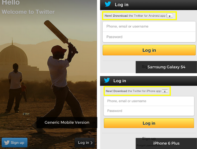
1. Twitter
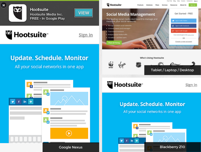
2. Hootsuite
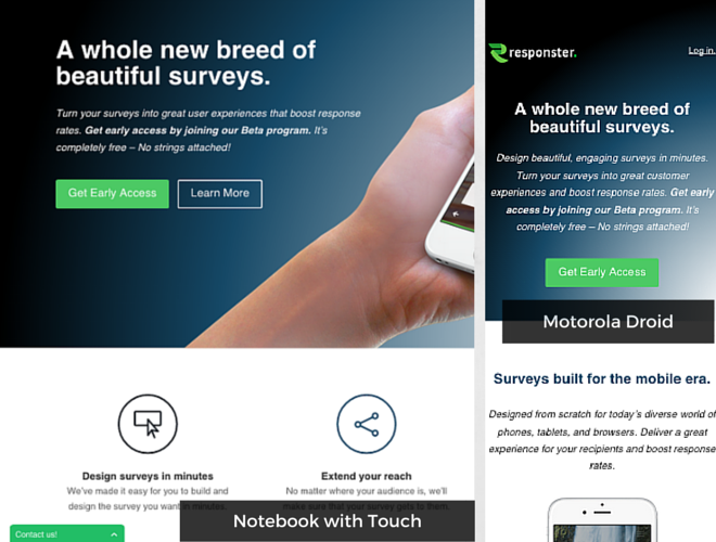
3. Responster
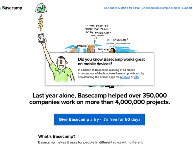
4. Basecamp
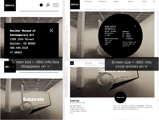
5. Boulder Museum of Contemporary Art
Ten Tips:
1. Put hours and location information front-and-centre.
Ideal for: retailers with brick + mortar locations.
Another great way to improve user experience would be to include a list that live updates with open locations, or tell mobile visitors which stores are open / closed depending on the time. A perfect use-case for this would be if you’re having an event, like the wedding site for Frank + Vivian from Studio Function. If someone’s visiting your website from a mobile device and you have a big event coming up, chances are they’re looking for related information.
2. Show off what you’ve got / can offer a specific market.
Ideal for: developers, productivity apps / platforms, design + dev studios.
Basecamp does a great job of this on browser resize. If you have a business that targets other devs (ie. people who will also be resizing their browser to see if your site is responsive), why not include something that sends them a message. Or if your business specializes in app development, mobile strategy, etc., make this information easy to see.
3. Point visitors to where they can download an app for their device.
Ideal for: If you have an app.
If you don’t, give users an option to sign up for updates. If your team hasn’t developed an app for a popular platform or device it might be a good idea to explain that decision in a blog post or FAQ, like this.
4. Put search bar up-front + popular stories of the day.
Ideal for: news / magazines, story sites.
Someone visiting a site that’s about news or stories is probably looking for a specific post or article. Make it easy for them to find this information quickly.
5. Talk about who you are and what you do right away.
Ideal for: people building their rep, start-ups
Kind of like the Responster idea above, move information about who you are to the top so site visitors quickly get to what’s important. If most people visiting your site will be first-time visitors, you’ll want them to know what you’re about right away.
6. Make finding the calendar and scheduling an appointment really easy.
Ideal for: real estate agents, personal trainers, life coaches, therapists, etc.
If your business relies heavily on setting appointments and your availability.
7. Use < a href="tel:#" >Click to call< /a > or < a href=“sms:"" >Click to text< /a>.
Ideal for: real estate agents, personal trainers, life coaches, therapists, etc.
This also works if you’re business relies heavily on setting appointments or your calendar. Say, for example, you’re a real estate agent. If someone is visiting your site from a mobile device they probably want to know where you are or need to get in touch with you quickly.
8. Highlight sale / specialty items.
Ideal for: small retailers, e-commerce stores, authors, speciality food / clothing stores.
If you’re a small or specialty retailer, or an author, you have an opportunity with RWD to promote any new products or books. Again, visitors from a mobile site are probably not going to spend a lot of time on your page, so just including a pop-up with any news or updates can help them navigate.
9. Another app idea: show mobile users what your app looks like on their device.
Ideal for: if you have a new, yet-to-be-released app.
I haven’t found any examples of how this could be used, but if you have an app that won’t be released yet you could show users on mobile devices what your app will look like on their specific device (instead of including a link to download the app for their device). Like a “sneak-peek”.
10. If possible, simplify the sign-in.
Ideal for: sites with communities, accounts, anything that requires users to log in.
Pulley was praised in this article for their super-simple sign-in process. The e-commerce app uses account urls, where the user types in a password to access their account.