How responsive design can be used to target your mobile audience.

Last week at HackerYou we covered responsive design in all it’s glory. The main idea is nothing new. In… response… to trends in mobile browsing, developers are building sites that look beautiful regardless of screen size that the site is being viewed on.
This got me thinking about messaging, of all things. Mainly I started to wonder if the message of a site changes when it goes responsive.
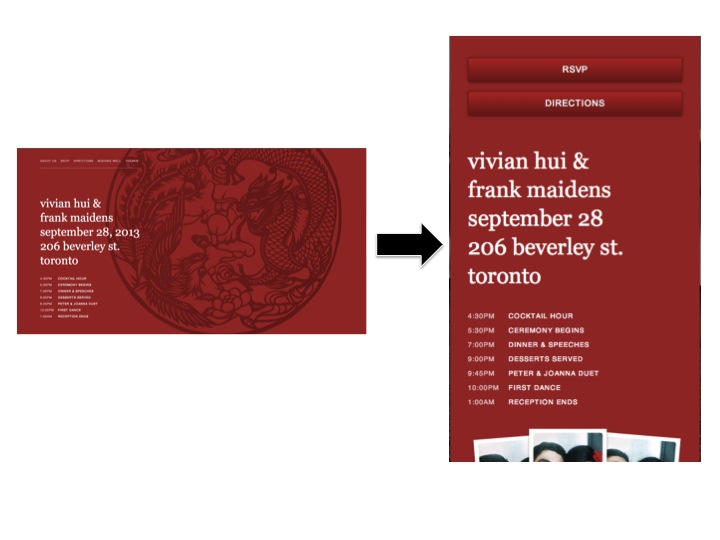
As developers, we make decisions about how the content on a page will shift to accommodate small screen sizes. In general we want to make sure none of the information is lost when a site goes from a large screen to a tablet or mobile phone. But we still have to decide what information will be in view from first mobile-glance.
Using huge margins and padding all over a page is good for readability, but space is at a premium on smaller devices. Time is a premium too. People spend a lot of it on their phones, and mobile users are usually going somewhere quickly. It’s safe to assume that they’re looking for very specific information: hours of operation, a phone number, a map, the date of an event, etc.
Beyond simple changes that make a site 100% easier to view on a small device, like shrinking images, navigation menus and text, there’s the way content is laid out. Having those basic, ‘quick-hit’ pieces of information at the top or front and centre of the smaller versions of a site makes all the difference.
The other thing I started thinking about after class was how responsive websites can offer unique marketing opportunities, not necessarily with changing information on the site, but using [or creating useful] content and arranging it on the site in a way that speaks directly to mobile users.
Take sites for web designers and developers as an example. Generally there’s a specific segment of the market looking at a site from a mobile phone. Someone who is looking at a web developers’ site from a mobile phone (or if they’re resizing their browser!) is probably a designer themselves, and a potential <wink>client</wink>.
Or, a tech company that’s releasing a new version of an app or smartphone will probably have a website highlighting all the new features of their product, but the responsive version of the site can highlight the new features of their product specifically applicable to mobile users first.
The best example I found of how this could work would probably be the site for iPhone app design and development company, RAMOTION. The largest version of the site features a full-background slider of work they’ve done.


When visiting the site from a mobile phone, the portfolio slider scales down. More room is left at the bottom of the screen for a header that says ‘We Build Mobile’.
I’m willing to bet a toonie that the minds behind ramotion.com knew that anyone visiting the site on a mobile device would probably be a potential client or connected to a potential client, so having that short but direct part of the heading for the next section visible on the home page speaks directly to that audience. It also lets visitors know to scroll down!
What do you think? Is it possible to use responsive design to target certain site users or should responsive design be left alone?
*Wedding site images courtesy of studiofunction.com/wedding, designed by Frank Maidens. RAMOTION site images courtesy of… RAMOTION.com